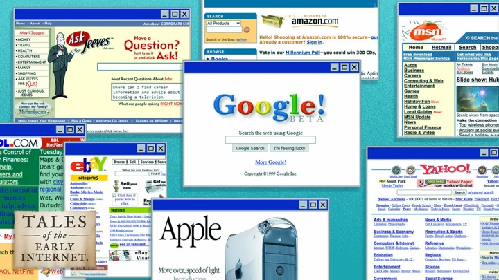
In Tales of the Early Internet, Mashable explores online life through 2007 — back before social media and the smartphone changed everything.
The year was 1999: Cher’s "Believe" was blasting on pop radio stations, Bill Clinton was impeached, Jar Jar Binks hit the Big Screen, and the beep, beep, static of dial-up internet echoed in family rooms across the globe.
The World Wide Web was still young then — gawky, awkward, and painfully slow. The dot-com bubble was still growing, on the cusp of bursting. The public had been using the internet for under a decade and those making online content (before we even called it content en masse) were often just throwing stuff at the wall.
"The 1990s were marked by exploring the possibilities of graphic design on the web and searching for ways how to approach web design, since at that time the vast majority of web designers only had experience with the design of printed material," Petr Kovar, the founder of the Web Design Museum, which curates online exhibits about sites from the ‘90s and early aughts, told Mashable in an email.
Many websites today look the same because there is greater "emphasis on accessibility, applicability, and UX at the expense of visual originality," Kovar said. That’s not a bad thing, added the UX designer based in Prague, but it does leave web designers from the ‘90s like him pining for colorful backgrounds and Comic Sans. Although, that aesthetic wasn't embraced by corporate brands, with many like Amazon, AOL, and AltaVista opting for box grids and just a splash of color just before the new millennium. (AOL was the most vibrant of the bunch at the time.)
While many services archive the web, like the Internet Archive with its influential Wayback Machine, Kovar organizes the historical snapshots to provide better context about the internet’s past. Want to see what porn, music, movie, and soccer websites looked like decades ago? Kovar’s museum has a sampling. The museum also has a collection of search engines from the ‘90s, many of which you’ve probably never heard of. After all, Rough Guides, the travel guidebook brand, didn’t include Google in the index of its internet guidebook in 1999. (Yes, people wrote books for internet tourists back then.)
SEE ALSO: HOTorNOT: The forgotten website that shaped the internet"The generation of internet users born after 2000 has only a very vague idea of what websites looked like in the 1990s and around the year 2000," Kovar said.
Let’s fix that. To freshen our memories and give the TikTok teens an internet history lesson, below are a selection of homepages from 1999. Some are in Kovar's collection, some I had to hunt for using the Wayback Machine. (For even more of a trip, visit the Web Design Museum directly.) You can see shades of the current Google in its 30-year-old snapshot, but Apple's is worlds away from today. And the White House homepage, yeesh.
AltaVista was the search engine my family used in the '90s. It was founded in 1995, bought by Yahoo in 2003, and then shuttered in 2013. It had strong grid energy in 1999. Credit: Web Design Museum Amazon had already expanded beyond books into electronics and other goods by 1999. Its homepage back then was filled with blue hyperlinks. Today, it's all slick and shiny with lots of product cards. Credit: Web Design Museum AOL sure loved vertical columns in 1999. It still has a homepage today, but it's filled with so many more images and video. Credit: Internet Archive In 1999, Apple had a "Hot News Headlines" section on its homepage. Now its homepage is all bold colors and feels like the spirit of Helvetica. Credit: Web Design Museum Jeeves was still around in 1999. The search engine once hosted by a cheery butler is now just called Ask.com after it got steamrolled by Google. Credit: Web Design Museum When's the last time you heard someone mention the metasearch engine that used to fetch answers to web queries? Like so many other homepages of 1999, Dogpile was covered in blue hyperlink. Credit: Web Design Museum Awww look at 4-year-old Ebay, with its funky fonts and colors. Those random capital letters are giving me extreme early internet vibes. Credit: Web Design Museum On a non-doodle day, Google's homepage doesn't look that drastically different from 1999. (Minus that big Beta.) Credit: Web Design MuseUM MSN's 1999 homepage has the same love for grids as AltaVista and so many other websites back then. Credit: Internet Archive Back in 1994, the Clinton Administration launched the first White House Website. By 1999, when Clinton was still in office, it looked like a sad, brown sack. Nowadays, the White House website looks like it was based off a premium Wordpress theme, and it is constantly losing links to scientific information about climate change. Credit: Internet Archive Yahoo bought Geocities in 1999 for $4 billion. The popular site, with its themed communities, was at one point the third most visited website on the web. RIP. Credit: Web Design Museum
